Senior Product Designer

Heena Davidson

I design for outcomes, not outputs. My work sits between user research, strategic design, and commercial experimentation. I help define the problem, design the solution, and measure whether it worked.

+17bps
Add to cart lift,
sticky ATC experiment
+$7.5M
Annualised revenue
impact
93%
Statistical significance,
attachment A/B
+7%
Revenue uplift,
attachment redesign
01
AI Experience Design Research
AI Adoption &
Experience Design
Led research and design for JB Hi-Fi's AI search, from trust research through to live experiments. $334K incremental revenue in 11 days, $262 return per $1 spent on AI.
$334K
Incremental revenue,
11 days
View case study
02
CRO A/B Testing
Conversion Rate Optimisation —
JB Hi-Fi Product Detail Page
Four hypothesis-driven experiments on the highest-traffic page in the funnel. Sticky cart, localisation, filter redesign, quick view. Designed, shipped, measured.
+17bps
Add to cart lift
View case study
03
Journey Design Recommendation Systems
Product Attachment &
Recommendation Journey
Redesigned the full recommendation system across JB Hi-Fi's PDP. Introduced Similar Items, fixed FBT logic, drove +7% revenue uplift at 93% statistical significance.
+7%
Revenue uplift
View case study

I design for outcomes, not outputs. My work sits between user research, strategic design, and commercial experimentation. I don’t just design the solution — I help define the problem and measure whether it worked. Currently at JB Hi-Fi leading AI adoption and A/B experimentation across the purchase journey, with $7.5M in annualised revenue impact to show for it.

End-to-End Product Ownership AI-Assisted Prototyping (Claude Code, VS Code) Figma Design Systems & Standards CRO & Experimentation Qualitative & Quantitative Research Journey Mapping Stakeholder Facilitation Coaching & Mentoring eCommerce & Omni-Channel Retail
JB Hi-Fi · CRO & Experimentation · 2023–Present

Conversion Rate Optimisation —
PDP & Category Page

Four A/B experiments across JB Hi-Fi's product detail and category pages. Designed, shipped, and measured with statistical rigour.

Role
Senior Experience Designer
Owned
Research, hypothesis formation, variant design, result interpretation
Scope
CRO, A/B Testing, Interaction Design
Collaborated with
Product, Engineering, Analytics
Results at a glance
+17bps
Add to Cart lift — Sticky CTA
+$7.5M
Annualised revenue — Localisation
+24bps
ATC rate at >99% stat. sig.
153K
Filter clicks — expanded variant (winner)
Context

The JB Hi-Fi PDP is the highest-traffic, highest-stakes page in the purchase funnel. Small improvements in conversion here have outsized commercial impact. Working with product and analytics, I identified hypotheses, designed the variants, and interpreted results to guide shipping decisions.

My role wasn’t just to design variants. It was to think like an experimenter. Start with a behaviour-based hypothesis, design for the friction point, let the data decide what ships.
The experiments
Experiment 01
Sticky Add to Cart

Hypothesis: A persistent Add to Cart CTA that follows the user as they scroll will reduce the friction of returning to purchase — increasing both ATC and purchase conversion.

+17bps
Add to Cart rate
90% stat. sig. · Shipped
Control — Standard ATC
Control — standard Add to Cart button
Variation — Sticky CTA ✓ Shipped
Variation — sticky Add to Cart bar
The problem

Users who scrolled past the Add to Cart button had no persistent way to purchase — requiring scroll-back, causing drop-off.

The design

Sticky bottom bar — keeps the CTA persistently visible as users scroll, without obscuring product content.

The outcome

+17bps ATC at 90% stat. sig. (5.90% → 6.07%). Purchase CVR directionally positive but insufficient significance to confirm. Shipped on ATC.

Experiment 02
Product Availability & Localisation

Hypothesis: Surfacing localised delivery and in-store availability by default — showing a specific location rather than a generic toggle — will reduce purchase uncertainty and improve conversion, particularly on mobile.

+$7.5M
Annualised revenue impact
Based on $330 AOV · Shipped
Control vs Variation 1 — Winner
Control — Tab toggle
Variation 1 — Localised ✓
CVR to Purchase
+5bps
84% stat. sig. — mobile driven
Add to Cart Rate
+24bps
>99% stat. sig. — mobile driven
Annualised Revenue
+$7.5M
$330 AOV · +5bps purchase CVR
The problem

Tab-based availability required toggling between Delivery and In-store — friction at the highest-stakes purchase moment.

The design

Unified localised view showing delivery date and store availability together — personalised by default, no switching required.

The outcome

+24bps ATC at >99% stat. sig. and +5bps purchase CVR at 84% stat. sig. Shipped. +$7.5M annualised.

Experiment 03
Filter UI Redesign

Hypothesis: Expanding the filter panel by default removes the activation barrier — increasing engagement with product filtering and complementary discovery.

+11.4%
Filter engagement
153K clicks · Not shipped
Control — Collapsed filters
Control — horizontal filter bar
Variations — V1 All Closed · V2 One Open · V3 All Open
Variations V1 all closed, V2 one open, V3 all open
Original (collapsed)
137,812
baseline
Var 1 — all closed
138,291
+0.4%
Var 2 — one open
141,291
+2.5%
Var 3 — all open
153,539
+11.4% ✓
The problem

Collapsed filter required users to decide to engage with it — hiding a navigation tool behind an activation step.

The design

Four variants tested from collapsed to fully expanded. Fully expanded removes the activation step entirely — filter is just there.

The outcome

Variation 3 (all expanded): 153,539 filter clicks vs 137,812 baseline — 11.4% engagement uplift. The goal was not CVR — it was understanding how customers interact with filters to help them find products faster. Despite the positive signal, the experiment was not shipped as expanding filters cut off supplier-funded assets, a commercial risk the business was not willing to take.

Experiment 04
Quick View on Category Page

Hypothesis: Adding a Quick View overlay on category page product tiles will reduce the need to navigate away from the listing page — keeping customers in a higher-intent browsing state, and improving both purchase conversion and average order value.

+5bps
Purchase CVR — Var 1
72% stat. sig. · Not shipped
Control — Original category page
Control — original category page
Variation 2 — Quick View overlay
Results by variation
Product Purchase Rate
2.22%
Original
2.27%
Var 1 +5bps
72% stat. sig.
2.16%
Var 2 −6bps
88% stat. sig.
Average Order Value
$211.51
Original
$213.18
Var 1 +3.4%
44% stat. sig.
$180.58
Var 2 +1.2%
36% stat. sig.
The problem

Customers browsing the category page had to fully navigate to a PDP to access key product details — losing their place in the listing and increasing drop-off.

The design

Two variations tested: Var 1 removed the Add to Cart CTA from tiles; Var 2 introduced a Quick View overlay giving product detail access without leaving the category page.

The outcome

Var 1 showed a directional +5bps CVR at 72% stat. sig. Var 2 (Quick View) showed −6bps CVR at 88% stat. sig. — the overlay added friction rather than reducing it. Neither met the threshold to ship.

What I learned
On defaults
Opt-out beats opt-in
The expanded filter and sticky CTA both worked by removing the decision to engage. The desired behaviour became the path of least resistance.
On localisation
Specificity reduces anxiety
"Delivered Thursday to Richmond" outperforms "Delivery available" because it replaces uncertainty with a concrete commitment. Especially powerful on mobile, where trust is lower.
On reporting
Honest data builds credibility
Not every metric reached significance. The sticky cart shipped on ATC, not purchase CVR, because that’s what the data supported. Knowing when not to ship matters.
JB Hi-Fi · AI Experience Design · 2023–Present

AI Adoption &
Experience Design

I am currently leading end-to-end research, scoping, and experimentation for JB Hi-Fi's AI experience — mapping the opportunity space with the Product Owner, running primary research and design concepts, and validating the approach through live experiments.

Role
Senior Experience Designer
Owned
Research, opportunity scoping, concept design, experiment design
Scope
Research, AI UX, Experimentation
Collaborated with
Product, Engineering, Data Science
The Challenge

JB Hi-Fi is exploring how to integrate AI-powered search into its retail experience. Before designing anything, we needed to understand the mental models and trust drivers that would determine whether customers would engage at all.

The risk wasn’t building the wrong AI feature. It was building the right feature in a way that eroded trust before customers had a chance to experience its value.
Scoping the opportunity

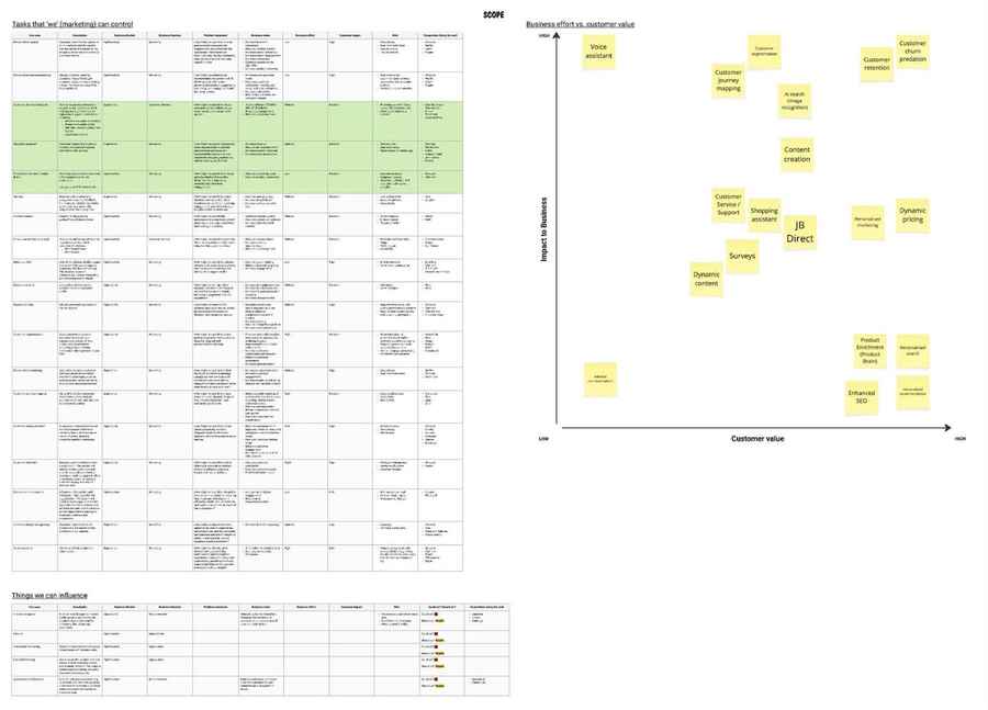
Before committing to any direction, working with the Product Owner, I led a structured exercise to map every potential AI use case across JB Hi-Fi — evaluating each against business effort, customer impact, risk, and competitive landscape. The goal was to separate genuine opportunities from noise, and ensure the team invested in AI initiatives with real commercial and customer value.

The matrix below plots use cases from low to high on both business impact and customer value axes. Highlighted in green are the initiatives already in motion — including AI search, which sits in the high-value quadrant alongside personalised search and shopping assistant. This exercise directly shaped the decision to prioritise AI search as the first live experiment.

AI use case scoping — business effort vs customer value Click to zoom
AI use case scoping matrix
Research approach

To understand how customers perceive, trust, and adopt AI in a retail context, I ran two studies in parallel.

Survey
  • 100 responses
  • Ages 22–60
  • Male and female
  • Familiar with AI tools (ChatGPT, Gemini)
Interviews
  • 12 participants, 90-minute sessions
  • Ages 22–67
  • Male and female
  • 2 participants not familiar with AI tools
Key takeaways

Across both studies, three clear themes emerged that shaped every design decision that followed.

Goal 1
Customer perception of AI in retail
  • Customers are already using ChatGPT and Gemini
  • They expect AI to mirror the in-store experience
Goal 2
Customer challenges in the shopping journey
  • Discovery and research are the biggest opportunities
  • Turn needs into confident purchase decisions
  • Purchase and post-purchase AI is useful — within clear limits
Goal 3
Expected actions AI should complete
  • Incorrect AI information breaks trust and harms brand
  • High-risk or money-related tasks — customers want a human
  • Seamless context transfer to human is critical

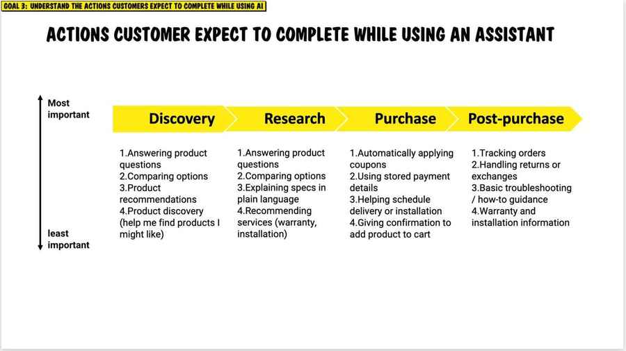
A key output of the research was understanding where AI fits in the shopping journey. I mapped the actions customers expected AI to complete across discovery, research, purchase, and post-purchase — ranked by importance. Discovery and research tasks consistently ranked highest; purchase and post-purchase actions came with significantly more anxiety around trust and accuracy.

Actions customers expect AI to complete — ranked by importance across journey stages Click to zoom
Customer journey expectations for AI — discovery, research, purchase, post-purchase

This finding directly shaped the decision to focus the first experiment on search and discovery — the highest-value, lowest-risk entry point — rather than attempting to automate purchase or post-purchase actions before trust had been established.

Design direction

The four takeaways became four design constraints. These weren’t preferences. Each one was a direct response to a specific finding, and any concept that violated them was ruled out before we explored it further.

Constraint 01
Opt-in by default

Never force AI on customers — frame it as a new option, not a replacement for standard search.

From the research: customers who felt they could ignore or override AI were significantly more willing to try it. Forced exposure killed trust before the experience had a chance.
Constraint 02
Transparent reasoning

Show why results are being suggested, not just what they are.

From the research: customers didn't need AI to be perfect — they needed to understand its reasoning. Showing the "why" increased trust more than improving result accuracy.
Constraint 03
Low-stakes entry

Use beta labelling and clear escape paths to reduce perceived commitment.

From the research: customers were more willing to try something unfamiliar when they felt the stakes were low. Beta framing and a visible exit removed the fear of being locked in.
Constraint 04
Conversational framing

Position as a search assistant, not an AI product, to reduce anxiety.

From the research: "search assistant" and "new way to search" outperformed "AI search" in willingness to try. The word "AI" raised the perceived risk; the word "assistant" mirrored the familiar in-store staff experience.
Design concepts

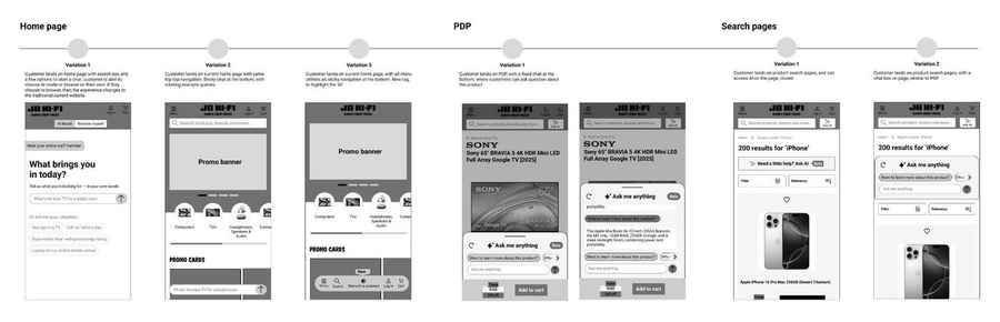
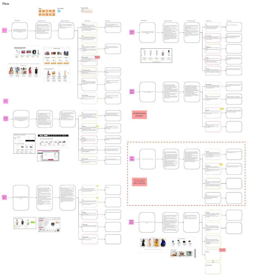
This project is ongoing. In parallel with the live experiment, I am designing across the full end-to-end AI experience — mapping where AI assistance can be introduced at every stage of the customer journey, from home page through to post-purchase. The wireframes below represent current ideation across the home page, PDP, and search results, with the full journey still being defined.

AI entry point concepts — home page, PDP & search pages Click to zoom
AI wireframe concepts across home page, PDP and search pages
Home page

I explored three concepts — from a full AI-mode toggle giving customers the choice to browse with or without AI assistance, to a sticky chat at the bottom, to a subtle menu tag. Each reflects a different philosophy on how prominently to surface AI at the start of the journey.

Product detail page

A contextual AI assistant embedded on the PDP — allowing customers to ask product-specific questions at the highest-intent moment in the journey. Framed as "Ask me anything · Beta" to signal transparency and reduce perceived risk.

Search pages

Two concepts for AI on search results — a subtle "Need a little help? Ask AI · beta" prompt above results, and a more prominent embedded conversational interface. The live experiment tested the latter, informing which entry point drives genuine engagement.

These concepts are early-stage ideation. The live experiment on the search page entry point provided the data foundation to evaluate which direction to progress.

The experiment

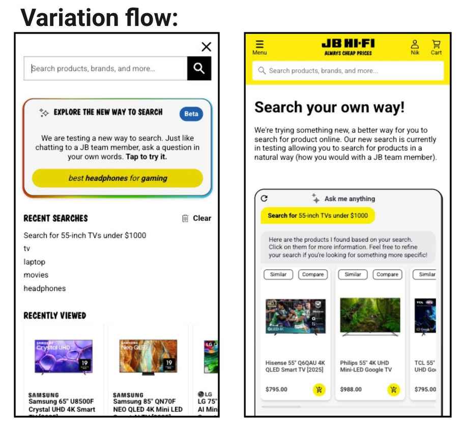
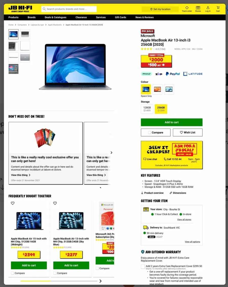
The research principles were validated through a live opt-in experiment — an AI-powered conversational search experience, explicitly labelled as beta, framed as "a new way to search." Every design decision I made reflected the research: opt-in entry, transparent framing, visible control, conversational language.

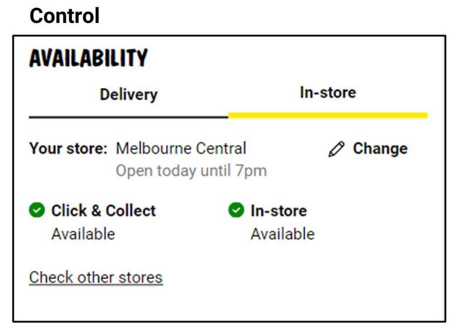
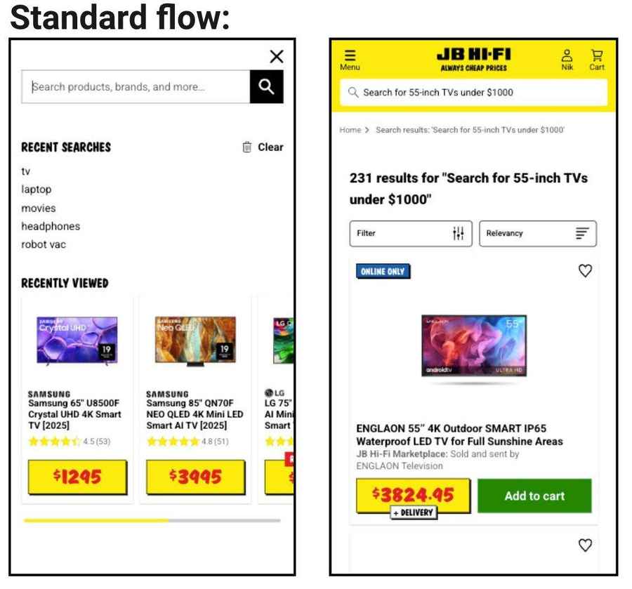
Control — Standard search flow
Control — standard JB Hi-Fi search
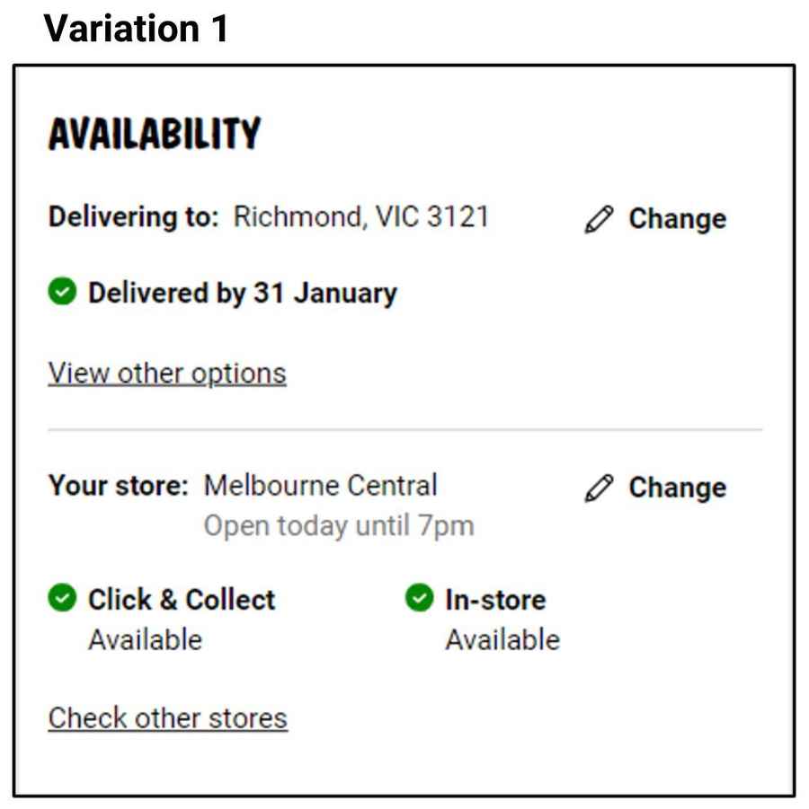
AI flow — Opt-in conversational search

The AI flow introduced an opt-in entry card within the standard search overlay — "Explore the new way to search · Beta" — inviting customers to try a conversational search experience without replacing the existing flow. Customers who engaged entered a natural language search interface, framed as a JB Hi-Fi team member, returning curated results with similarity and comparison actions.

78K
Impressions
over 11 days
1.23%
Opt-in CTR
963 customers
36%
Engagement rate
343 first messages sent
$262
ROI per $1
spent on AI
Purchase conversion rate
1.45%
Control
Standard search
5.36%
AI flow
+3.91 percentage pts
Average order value
$476
Control
Standard search
$503
AI flow
+$27 per order
The CVR and AOV lifts reflect a self-selected, high-intent group — customers who chose to try AI search. The more meaningful signal is the ROI: $134 total cost to run the experiment, against $334K in incremental revenue over 11 days. The case for investment is clear.

The experiment ran for 11 days at a total AI message cost of $134. Incremental revenue attributable to the AI flow was $334K over the period — a $262 return for every dollar spent. This established the commercial baseline for the next phase of investment.

What's next

The experiment validated the core thesis — opt-in, transparently framed AI search drives higher-intent engagement and meaningful commercial return. The next phase focuses on scaling the experience: improving result relevance, reducing the opt-in friction, and testing embedded entry points earlier in the search journey. The research foundation I established in phase one continues to guide every design decision going forward.

JB Hi-Fi · Journey Design · 2023–Present

Product Attachment &
Recommendation Journey

JB Hi-Fi's recommendation system had a problem everyone knew about but nobody had fixed — FBT was surfacing competing products instead of complementary ones. I found the root cause, redesigned the system, and drove +7% revenue uplift at 93% statistical significance.

Role
Senior Experience Designer
Owned
Competitive research, journey mapping, system redesign, variant design
Scope
Journey redesign, Interaction Design, Analytics
Collaborated with
Product, Engineering, Merchandising, Analytics
The Problem

Accessories, warranties, and complementary products are some of JB Hi-Fi's highest-margin commercial levers — and the attachment recommendation system is what drives them. The issue had existed for a while.

  • Attachment modules appeared inconsistently across discovery, PDP, and cart without a system for when or why
  • FBT was surfacing same-category products — a laptop PDP showed more laptops, not accessories
  • No Similar Items or View Alternatives experience existed anywhere in the journey
  • Overlapping recommendation types created paralysis rather than helping customers decide
The most damaging issue wasn't what was missing — it was what was there but wrong. FBT was actively cannibalising the primary purchase by surfacing competing products. Everyone knew. Nobody had fixed it.
Research & Insight
Competitive recommendation mapping

Before proposing any solution, I needed to answer a specific question: what is FBT actually supposed to do — and what should be doing the jobs it wasn't? I mapped every major recommendation model across key competitors, documenting the job-to-be-done, placement logic, and use cases for each. The goal wasn't a catalogue of what exists. It was to build an evidence-based case for which models JB Hi-Fi needed, which were being misapplied, and why the logic needed to change — not just the design.

Competitive mapping — Miro board Research phase
Competitive recommendation mapping
Click to zoom
Mapping Similar Items, Buy Again, FBT, On Sale, Recently Viewed — each with JTBD, market examples, placement logic, and use cases documented.
What the mapping concluded

The mapping confirmed what the data suggested — FBT and Similar Items are fundamentally different tools serving different jobs, and conflating them was causing both to fail. Two decisions followed directly:

  • Keep FBT — but redesign it. FBT was the right model for JB Hi-Fi's context, but the visual design made tiles indistinguishable from other product tiles across the site. A distinct visual treatment was needed so customers could immediately understand they were in a complementary purchase moment, not browsing.
  • Introduced Similar Items and View Alternatives. These models were absent from the experience entirely, despite being standard practice. Adding them gave customers a structured way to explore alternatives without leaving the PDP.
Changing how recommendations worked

Redesigning the UI without fixing the underlying logic would have been cosmetic. The root cause was algorithmic. FBT was trained to surface same-category products, so a TV PDP showed more TVs. Working with engineering, we changed the logic to surface complementary items: a TV PDP now shows a soundbar, a wall bracket, an HDMI cable. Items that complete the purchase, not compete with it. This was as much a product decision as a design one, and getting it across the line required the competitive mapping to make the case.

Fixing the logic wasn’t a design decision. It was a product decision that required a design case. The competitive mapping gave us the language to make it.
Before & After

Three changes came directly from the diagnostic: fix the FBT logic, visually differentiate FBT from generic product tiles, and introduce the missing models. Each change had a specific job.

Change 01
FBT logic — same to complementary
Previously surfaced same-category products. Changed to complementary categories — accessories, warranties, compatible add-ons that complete the purchase.
Change 02
Similar Items introduced
Added as a dedicated module — giving customers a structured way to explore alternatives without leaving the PDP or returning to search.
Change 03
View Alternatives on tiles
Added inline to product tiles — letting customers explore options without navigating away, reducing PDP abandonment from indecision.
Before FBT showing same-category products. No Similar Items. No View Alternatives.
Before — laptop PDP with same-category FBT
FBT surfaces more laptops on a laptop PDP — same category, not complementary. No Similar Items. No in-tile discovery.
After FBT showing complementary categories. View Alternatives on each tile.
After — TV PDP with complementary FBT and View Alternatives
TV PDP: FBT shows a wall mount ($69) and soundbar ($399). "View alternatives" on each tile for in-page discovery without leaving the PDP.
Design Direction

Fixing the FBT logic and introducing new models solved the product problem. The design challenge was making the system feel coherent across the full journey. Not a collection of modules — a single considered experience. Four principles shaped every decision:

  • Sequence matters more than placement. Attachments appear only after the customer has resolved their primary product decision — not during it.
  • Group, don't scatter. Consolidate complementary options into a single decision moment rather than distributing across multiple surfaces.
  • Make relevance visible. Language, hierarchy, and visual design should signal why a recommendation is being made.
  • Complement, don't compete. Every recommendation should make the primary purchase feel more complete — not introduce doubt.
Impact

Four variations were tested against the control — combining the new UX with varying levels of relevancy reranking. Variation 1 (new UX, no reranking) and Variation 4 (new UX, 80% relevancy reranking) both reached 93% statistical significance. The result validated the core thesis: fixing what the system recommended mattered more than how much it recommended.

+3.1%
Purchase rate
6,245 → 6,441 purchases
+7.0%
Revenue uplift
$2.08M → $2.22M
+3.0%
AOV increase
$306 → $315
+4.6%
Items per order
1.98 → 1.99 avg.

Product Recommendation Redesign — Var 1 · 93% stat. sig.

The honest trade-off

FBT engagement dropped across all variants (select from FBT down 15–19%, ATC from FBT down 10–18%). The redesign optimised for the right outcome — primary purchase conversion — even when that meant attachment module clicks declined. Protecting the primary purchase task was the goal, and the data confirmed it worked.

Variation
Select from FBT
ATC from FBT
Purchased (FBT)
Control (original UI)
7,371 (baseline)
821 (baseline)
551 (baseline)
Var 1 — New UX (0% relevancy)
−15.3%
−10.7%
−13.8%
Var 2 — New UX (30% relevancy)
−17.4%
−18.0%
−20.7%
Var 3 — New UX (50% relevancy)
−18.8%
−6.8%
−10.0%
Var 4 — New UX (80% relevancy)
−17.5%
−16.2%
−14.5%
A 7% revenue uplift on primary purchase conversion outweighs a reduction in FBT attachment clicks — the data validated the core design thesis.
Post-launch performance

Post-launch, module performance was tracked across the full recommendation suite over 90 days. The data confirmed the strategic intent — customers engaged differently with the new system, and the new modules earned meaningful revenue from day one.

Frequently Bought Together (PDP)
$937K
Revenue · 90 days
ATC events
102,184
Sessions with ATC
86,731
Attach rate (session)
0.28%
AOV
$442.73
Similar Items
$229K
Revenue · 90 days
ATC events
39,302
Sessions with ATC
33,745
Attach rate (session)
3.58%
AOV
$342.21
Don't Forget These (Cart)
$582K
Revenue · 90 days
ATC events
30,028
Sessions with ATC
22,170
Attach rate (session)
4.97%
AOV
$494.42
Browse Alternatives
$108K
Revenue · 90 days
ATC events
9,516
Sessions with ATC
7,942
Attach rate (session)
7.09%
AOV
$567.17

Notable patterns: Similar Items and Browse Alternatives — both new modules introduced as part of the redesign — show significantly higher session-level attach rates (3.58% and 7.09% respectively) than FBT (0.28%). This reflects the intent behind each module: FBT drives volume through broad reach; the new models drive higher-value attachment from customers already in a considered buying mode. The Don't Forget These cart module achieved the highest AOV at $494, reinforcing the value of late-funnel recommendation touchpoints.

Heena Davidson

Hi, I'm Heena

I design for outcomes, not outputs. My work sits between user research, strategic design, and commercial experimentation. I don’t just design the solution — I help define the problem and measure whether it worked. Currently at JB Hi-Fi leading AI adoption and A/B experimentation across the purchase journey, with $7.5M in annualised revenue impact to show for it.

End-to-End Product Ownership AI-Assisted Prototyping (Claude Code, VS Code) Figma Design Systems & Standards CRO & Experimentation Qualitative & Quantitative Research Journey Mapping Stakeholder Facilitation Coaching & Mentoring eCommerce & Omni-Channel Retail
Get in touch
How I work

Good design starts with the right problem. I ask a lot of questions before anything gets designed: talking to users, digging into data, pressure-testing assumptions with the team. It’s not indecision, it’s trying to avoid building the wrong thing. From there I take it through the full journey — shape the problem, design the solution, measure whether it actually worked. Always balancing what users need with what the business is trying to achieve.

JB Hi-Fi SCA Intrepid Belong
Teaching at UX academy
Teaching
Academy Xi

Lead instructor across two cohorts of a 6-month UX/UI design course — guiding career-changers through the full design process, from research and problem framing through to a final portfolio ready for industry.

Speaking at design community event
Community

Moderated a panel on human-centred design at a local design meetup — facilitating discussion for an audience of 100+ attendees.

Running a design workshop
Mentoring
Academy Xi

Supported students through a 6-month UX/UI design course as a mentor and teaching assistant — answering questions, giving design critique, and helping students work through problems during workshops and one-on-one sessions.

In life

Outside of work I’m usually planning the next trip or recovering from the last one. I’ve travelled to 30+ countries and counting. It’s the fastest way I know to get uncomfortable, see how other people solve problems, and come back thinking differently.

Closer to home I'm hunting down new coffee spots around the city, and attempting to bake things that occasionally turn out well.